This article contains paid links. As an Amazon Associate, I earn from qualifying purchases.
Kitchen cabinet color changes the way the whole room feels. Warm white can soften a busy stone counter, olive can bring older wood finishes together, and a deep blue can turn a plain bank of cupboards into the feature you notice first.
The best choice starts with the things you plan to keep: the floor, backsplash, countertops, and appliances. Once those pieces work with your cabinet sample, hardware and a few useful accessories can finish the room.
These 27 kitchen cabinet color ideas cover soft neutrals, greens, blues, richer dark shades, and a few cheerful surprises. There are also two-tone combinations if you would rather introduce color on the lower cabinets or island.
Choose the Color Beside Your Existing Finishes
Gather a countertop sample, a floor offcut if you have one, and two or three cabinet color samples. Look at them together in the kitchen’s daylight and under your evening lighting. Compare warm and cool versions of a color before narrowing the choice.
Start with the fixed surface that has the strongest undertone. Cream tile may favor a warmer white, while a blue-gray stone can change the way a beige cabinet reads. Sherwin-Williams’ cabinet project page includes options for trying color samples before a larger project.
If you are leaning toward quieter colors, these neutral kitchen ideas offer more ways to combine wood, stone, and soft painted finishes.
1. Warm White Cabinets With Light Oak
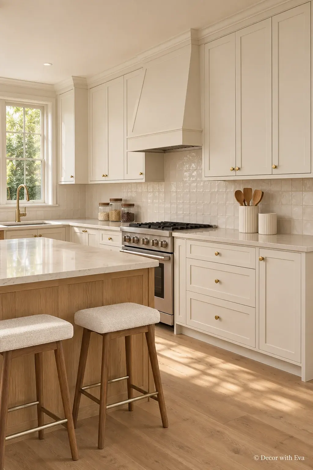
Warm white cabinets give you plenty of freedom with wood, stone, and everyday dishes. Choose a white with a little warmth when your floor is oak or your countertop has cream in its pattern. A stark blue-white can make those same finishes look yellower by comparison.
Let an oak island or a few wood stools provide the contrast. Small brass knobs add enough detail to plain doors; you do not need a different finish on every surface. Put the objects you use most in one counter zone and leave the main preparation area open.
Try this: Hold a white sample beside your existing backsplash and trim before deciding which white belongs on the doors.
2. Cream Cabinets With Champagne Cup Pulls
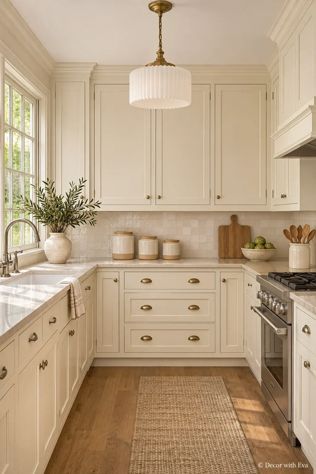
Cream is a lovely choice when bright white feels too sharp. It works especially well on inset doors, where the shadows around the frames give a pale color some depth. Pair it with warm white walls and a countertop that shares its yellow or beige undertone.
Champagne-colored cup pulls suit the drawers without making the kitchen look overly polished. A pleated milk-glass pendant repeats the softness overhead, while simple canisters keep the counter useful. Before changing a fixture, check its size, ceiling support, and installation requirements.
Try this: Compare cream samples with your appliances; a white refrigerator can make a yellow-leaning cream look stronger.
3. Putty Cabinets With Fluted Brass Knobs
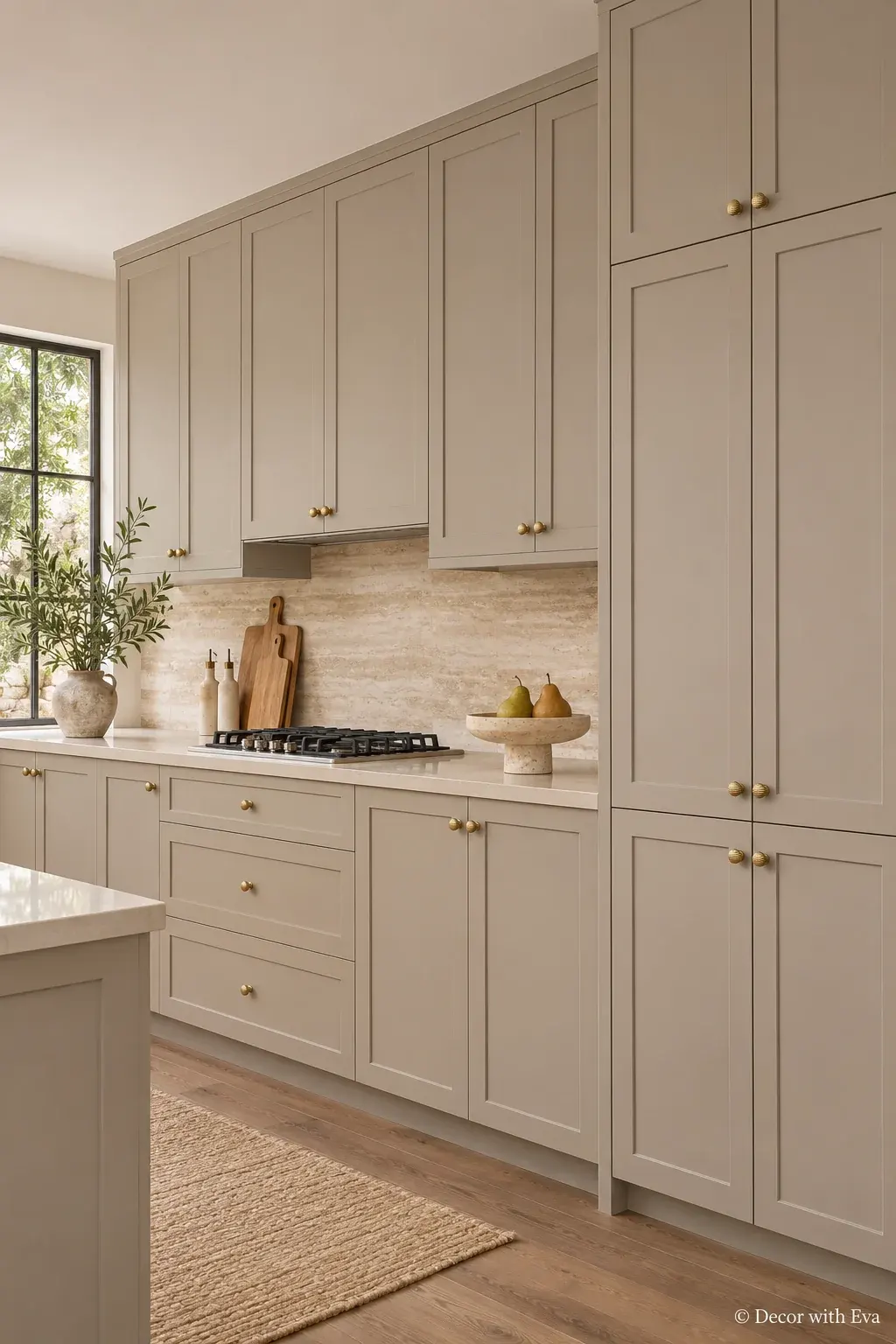
Putty sits between beige and gray, giving cabinetry a quiet color that still reads as a deliberate choice. Use it across a tall pantry and the base cabinets to make the storage feel connected. A pale, warm backsplash keeps the room from looking flat.
Fluted brass knobs add a small change in texture to smooth painted doors. Repeat the warm stone note in a shallow bowl rather than filling the counter with decorative objects. If you already own a plain ceramic bowl, try that before buying another accessory.
Try this: Set a putty sample next to the darkest fleck or vein in your counter, then see whether the combination feels balanced.
4. Greige Cabinets With Dark Countertops
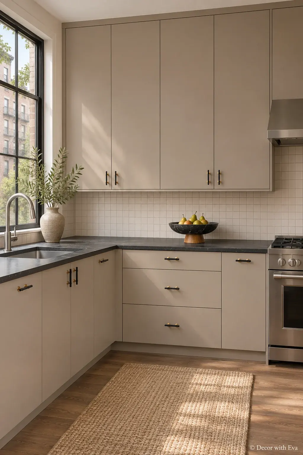
Greige cabinets can bridge a dark countertop and a light wall. The trick is finding a gray-beige that relates to both: a warmer shade beside brown stone, or a less yellow one beside cool charcoal. Keep the backsplash simple while you judge that relationship.
Black-and-bronze T-bar knobs give the doors a crisp edge. A dark marble bowl can repeat the countertop color on another surface, but leave enough clear worktop for real cooking. In a small kitchen, a few dark accents often look more purposeful than many little ones.
Try this: Photograph two samples beside the counter in daylight, then make the final choice by looking at them in person.
5. Mushroom Cabinets With Antique Brass
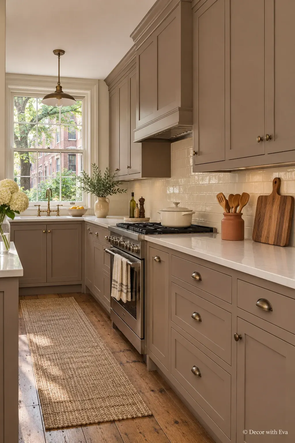
Mushroom brings more brown to the kitchen than a pale greige. It can be especially useful when you are keeping a warm floor, cream tile, or older brass details. Choose a muted shade so the cabinets and existing finishes feel related.
Antique-brass cup pulls suit a traditional door profile. Add a terracotta utensil crock and a wood board where you actually prepare food, keeping both clear of heat and splashes. A smaller collection of tools usually looks better and is easier to reach than a tightly packed crock.
Try this: Try mushroom on one large sample board before committing to a full run of upper cabinets.
6. Butter Yellow Cabinets With Polished Nickel
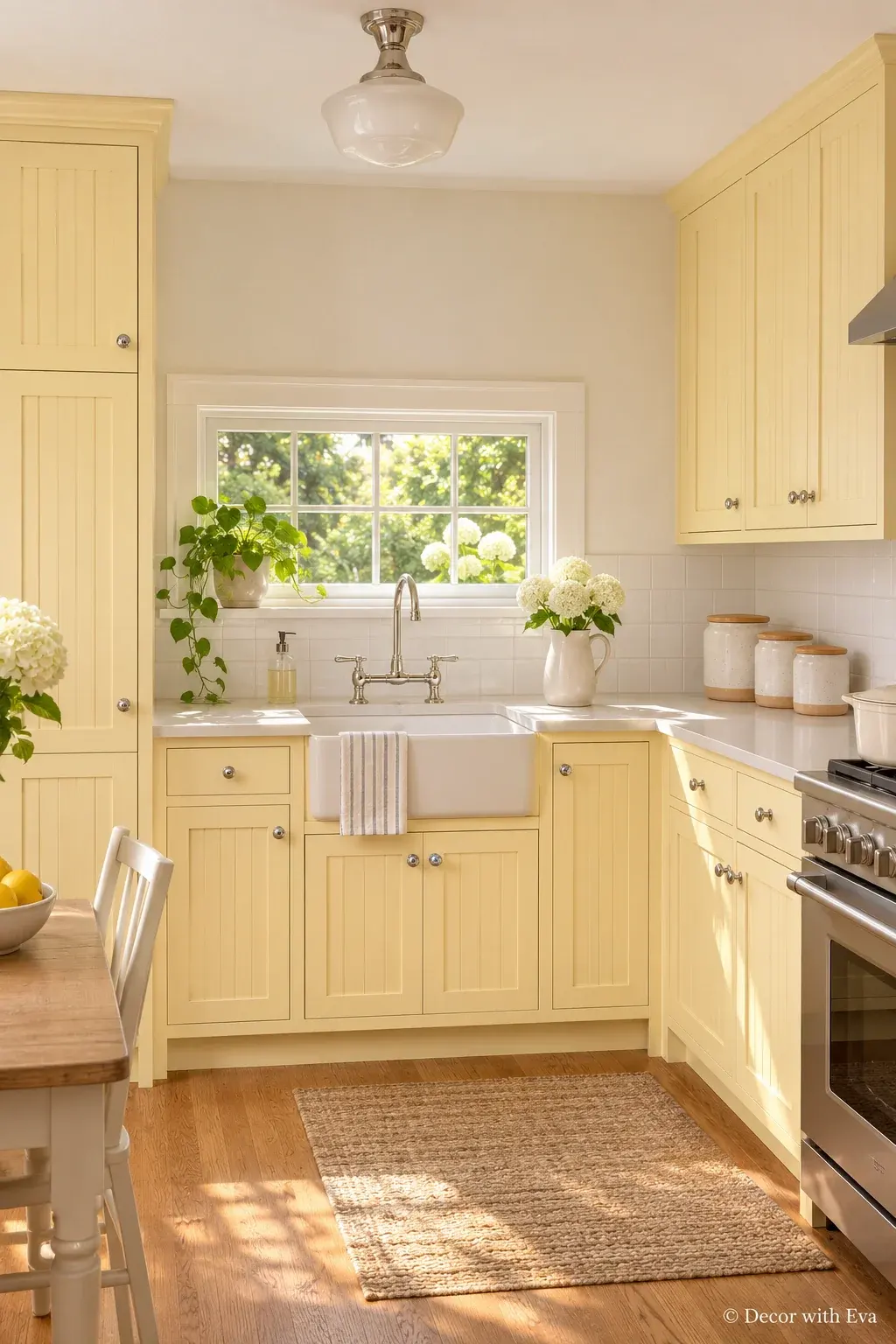
Butter yellow turns plain cabinet fronts into a cheerful part of the room. Keep the color soft enough that white counters, a porcelain sink, and simple tile still feel comfortable beside it. A lightly yellow cabinet can brighten the mood without needing matching yellow accessories.
Polished nickel ball knobs give the palette a clean, slightly vintage detail. Ivory canisters add a quieter version of the same warm color. If the room already gets golden afternoon sun, compare a less saturated yellow as well; warm light can make the color feel stronger.
Try this: Look at your yellow sample under the kitchen lights after sunset, not only beside a sunny window.
7. Sage Cabinets With Woven Counter Stools
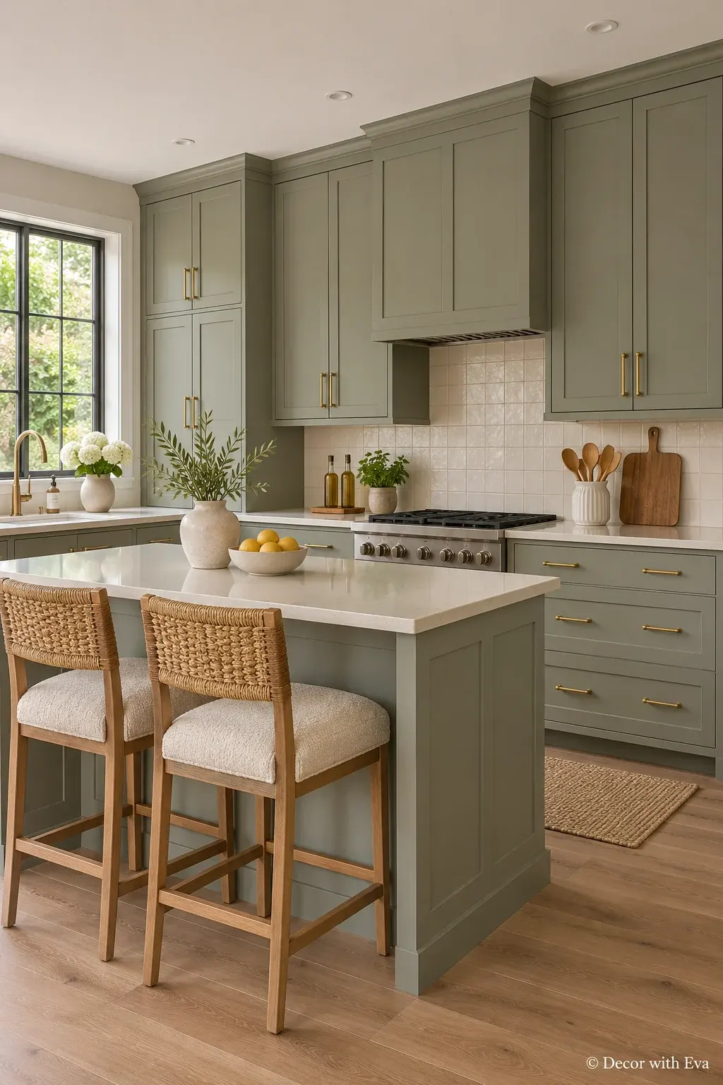
Sage is a good starting point if you want green cabinets with a gentle overall effect. Choose a gray-green for a restrained kitchen, then bring in cream counters and pale wood. Carry the color onto the island if you want the cabinetry to read as one connected arrangement.
Woven-back stools and warm brass pulls make the room feel relaxed rather than formal. The stools should suit the height and overhang of your counter, with room to sit and pull them out. Keep the woven texture in one or two places so the green remains the focus.
Try this: For more variations, explore these sage green kitchen ideas before choosing the exact depth of green.
8. Olive Cabinets With Warm Stone
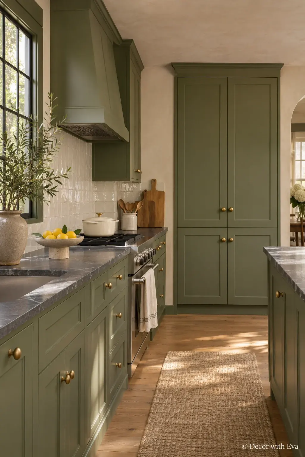
Olive has an earthy yellow-brown undertone that can work beautifully with warm stone and oak. It is deeper and warmer than sage, so give it a light wall or backsplash if you want the cabinet outlines to stay clear. A dark counter adds another level of contrast.
Small aged-brass knobs look at home on inset doors. A pale stone bowl gives the counter a lighter spot without introducing another strong color. Check natural stone care before using acidic cleaners, and put a protective base under a heavy accessory if the surface needs it.
Try this: Compare olive with a neutral gray-green sample; the difference is easiest to see beside the floor.
9. Forest Green Cabinets With Creamy Counters
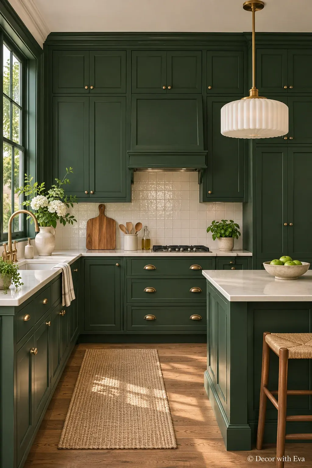
Forest green gives cabinetry a rich presence, particularly when tall pantry doors are part of the room. Creamy counters keep the palette welcoming, while a pale backsplash lets the green cabinet edges stand out. Repeat the green on the island for a more enveloping look.
Champagne-bronze cup pulls and a milk-glass pendant keep the details warm. Use a familiar cutting board as the wood accent, rather than introducing several new wood tones. The pendant should fit the island and sightlines; a broad shade can look much larger in a small room.
Try this: Check the forest-green sample on the cabinet run furthest from the window as well as the brightest one.
10. Mint Cabinets With Shiny Nickel Hardware
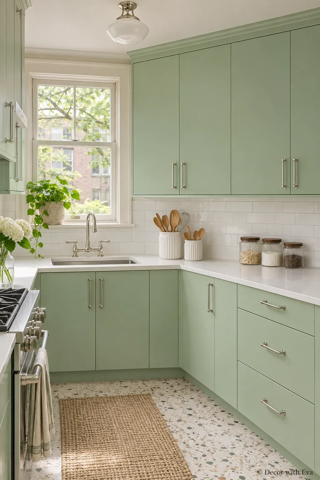
Mint cabinets bring a fresh, slightly vintage feeling to a kitchen. Choose a green with enough gray to sit comfortably beside the finishes you are keeping. White counters and straightforward tile give the color a clean backdrop, especially in an apartment kitchen.
Shiny nickel pulls suit the cooler side of mint. White utensil crocks and clear jars add storage without breaking up the color scheme. Keep wood lids as a small warm accent and group the containers where they will be used, rather than lining the entire counter.
Try this: Try mint beside a plain sheet of white paper, then beside your actual backsplash; the two comparisons can look surprisingly different.
11. Dusty Blue Cabinets With Pale Wood
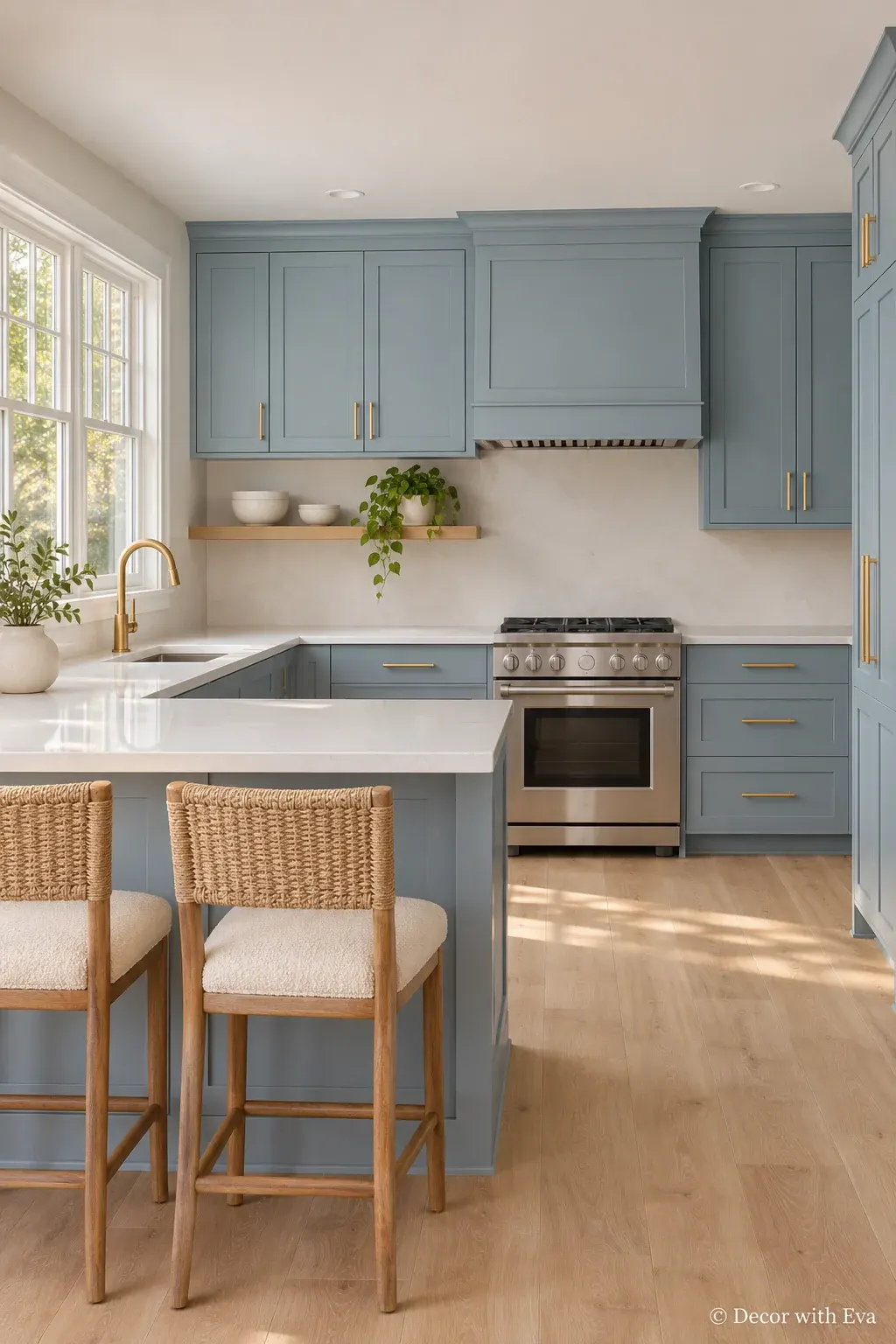
Dusty blue feels softer than navy and less icy than a very pale blue. It works well with light oak, white counters, and a simple cabinet profile. Use it on the main cupboard runs and let the wood show up in the floor, a shelf, or the seating.
Straight brushed-brass bar pulls give the doors a tidy rhythm. A woven-back counter stool adds texture without needing a patterned backsplash. If you are replacing handles, match the existing mounting-hole distance; the overall handle length is a different measurement.
Try this: Keep one blue sample beside your wood floor for a full day before choosing the final shade.
12. Navy Cabinets With Polished Nickel
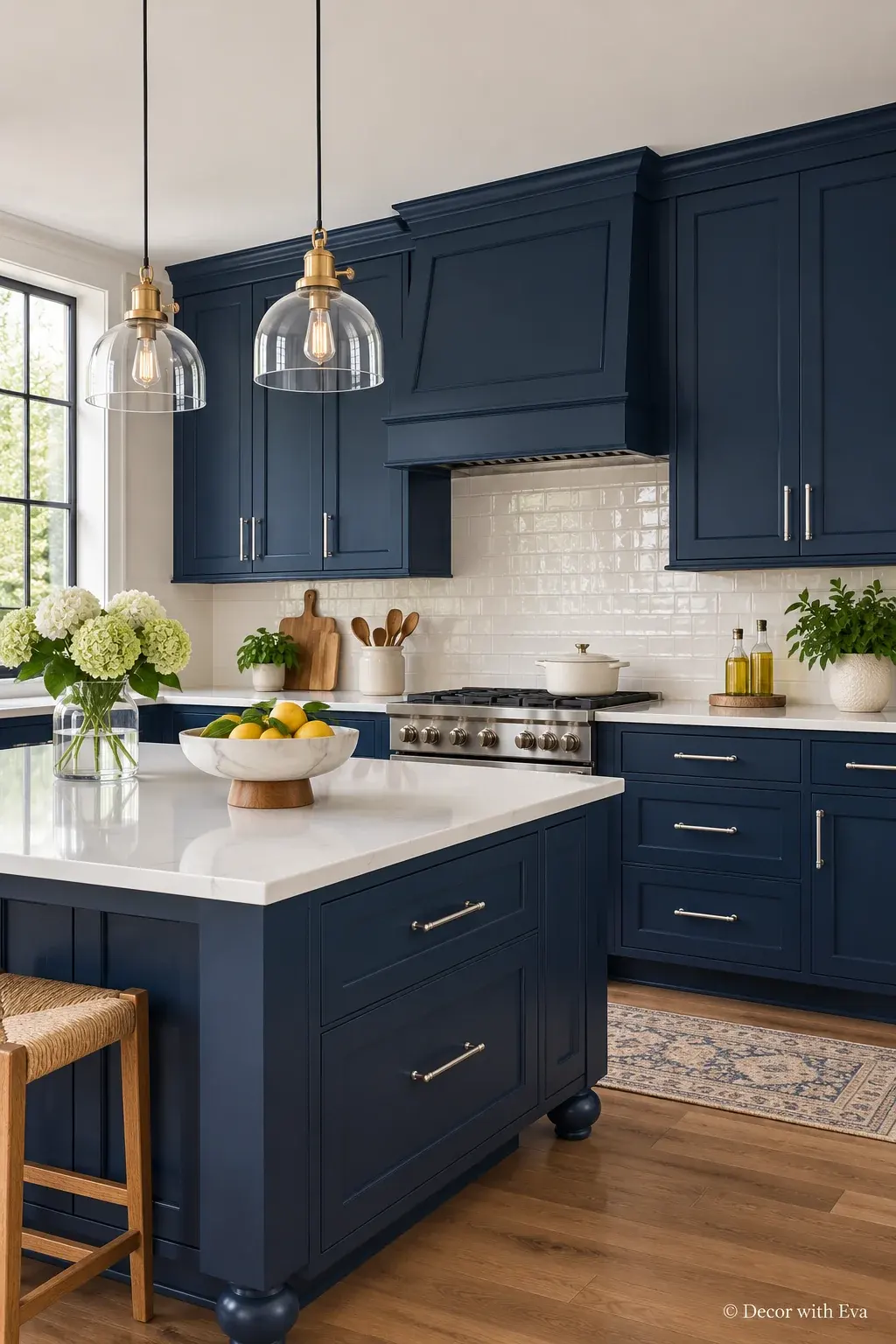
Navy cabinets can make a familiar white countertop feel more striking. Choose a navy that still reads blue in the room’s dimmest corner. Warm white tile and a lighter ceiling give the dark cabinetry a clear outline, so the room feels detailed rather than murky.
Polished nickel handles add brightness at hand level. Clear bell pendants let you see through the island area, while a white marble bowl repeats the counter color. You can keep an existing stainless faucet; every metal detail does not have to be replaced for the palette to work.
Try this: Try a navy door-sized sample before painting a tall pantry, where the color covers a much larger area.
13. Teal Cabinets With a Vintage Runner
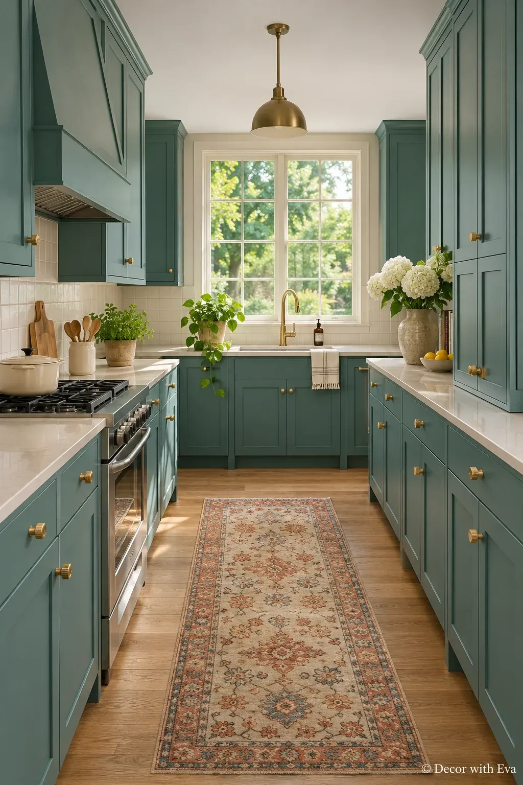
Teal gives you the energy of blue with some of green’s warmth. For cabinetry, a medium-depth shade can be easier to coordinate than a very bright turquoise. Pair it with ivory stone and a warm floor so the color has a comfortable setting.
Small fluted brass knobs add detail without competing with the doors. A muted terracotta-and-blue runner brings a related warm color to the floor. Measure the walkway and check dishwasher, oven, and cabinet-door clearance before adding a rug; its edges should lie flat.
Try this: Pull one quieter color from an existing rug or dish, then compare several teal samples around it.
14. Peacock Cabinets With Black and Brass Hardware
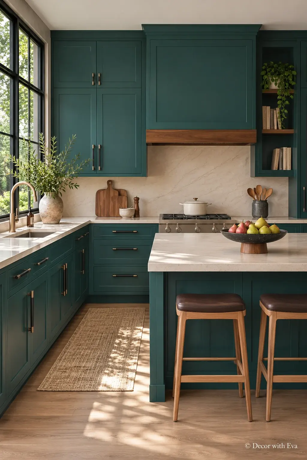
Peacock is the deeper, more dramatic relative of teal. It looks particularly good across simple cabinet fronts, where the blue-green has room to show. Creamy counters and a little walnut keep the palette rich without making every part of the room dark.
Black bars with bronze mounting details connect the cabinet color with warm wood seating. A black stone bowl repeats the darkest accent on the counter. For stools, check both seat height and the space needed to tuck them away; a compact backless style can help at a short island.
Try this: Keep the backsplash quieter than the cabinets so the peacock color carries the room.
15. Warm Gray Cabinets With Soft White Tile
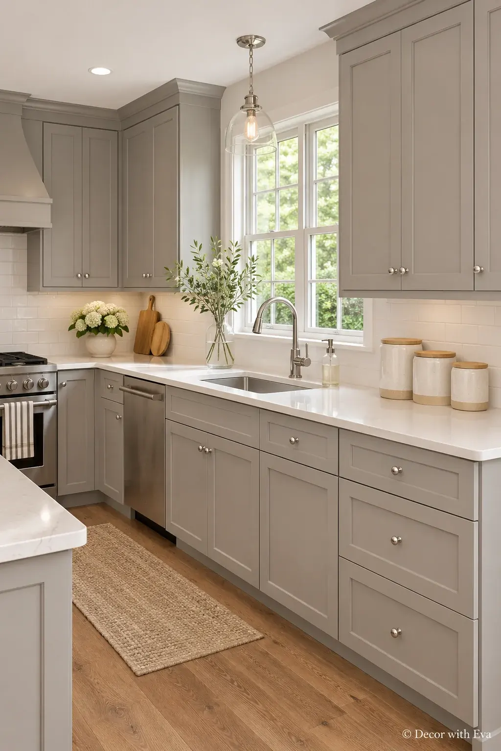
Warm gray offers a quieter alternative to a strong cabinet color. Look for a gray that relates to your counters instead of choosing it in isolation. A slight beige undertone can sit more comfortably with cream tile and wood than a sharply blue gray.
Polished nickel knobs keep a traditional cabinet profile looking crisp. Speckled ivory canisters add a little texture at the counter, especially if your backsplash is plain. Keep only the sizes you will use on display; the largest jar is not always needed in a small kitchen.
Try this: Compare warm gray and greige side by side. One may look much more natural with your existing stone.
16. Charcoal Cabinets With Natural Wood Accents
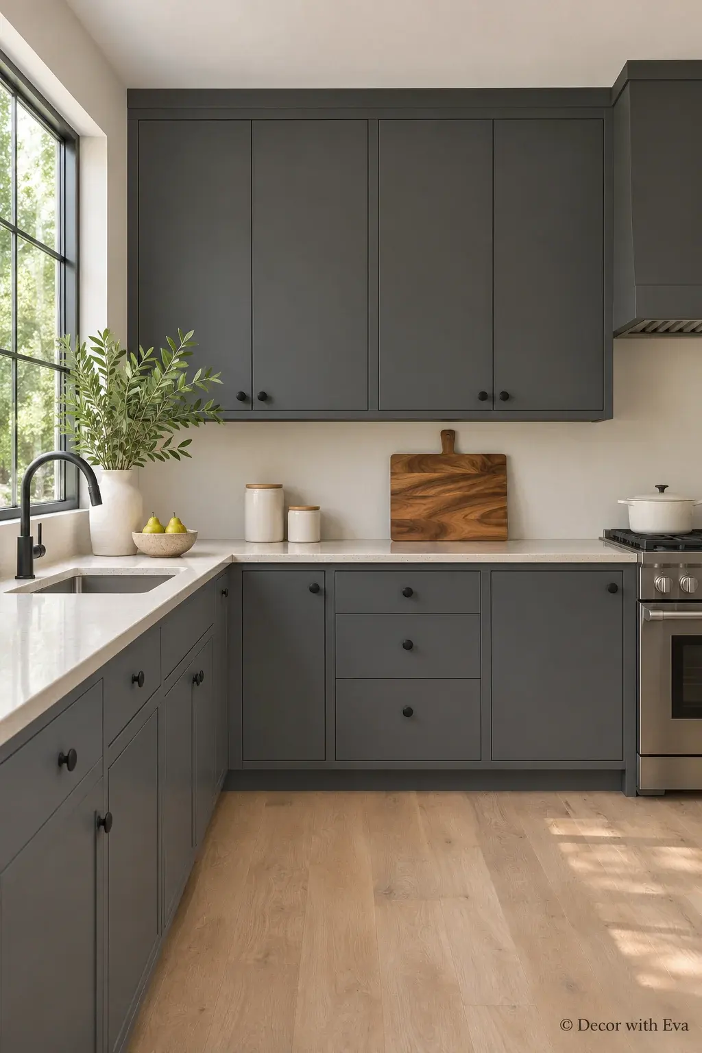
Charcoal works well when you like dark cabinets but want more visible gray than black. Let a pale counter run continuously across the kitchen, then use wood to keep the combination warm. Simple slab fronts give the color a different character from traditional paneled doors.
Matte-black round knobs sit quietly against charcoal. A broad wood cutting board can supply the texture, particularly if you do not have room for stools or shelves. Leave space behind a board for drying and keep it away from the cooktop rather than treating it as a permanent heat shield.
Try this: Check the darkest sample under your task lighting; you should still enjoy how the door edges and hardware read.
17. Soft Black Cabinets With Warm Brass
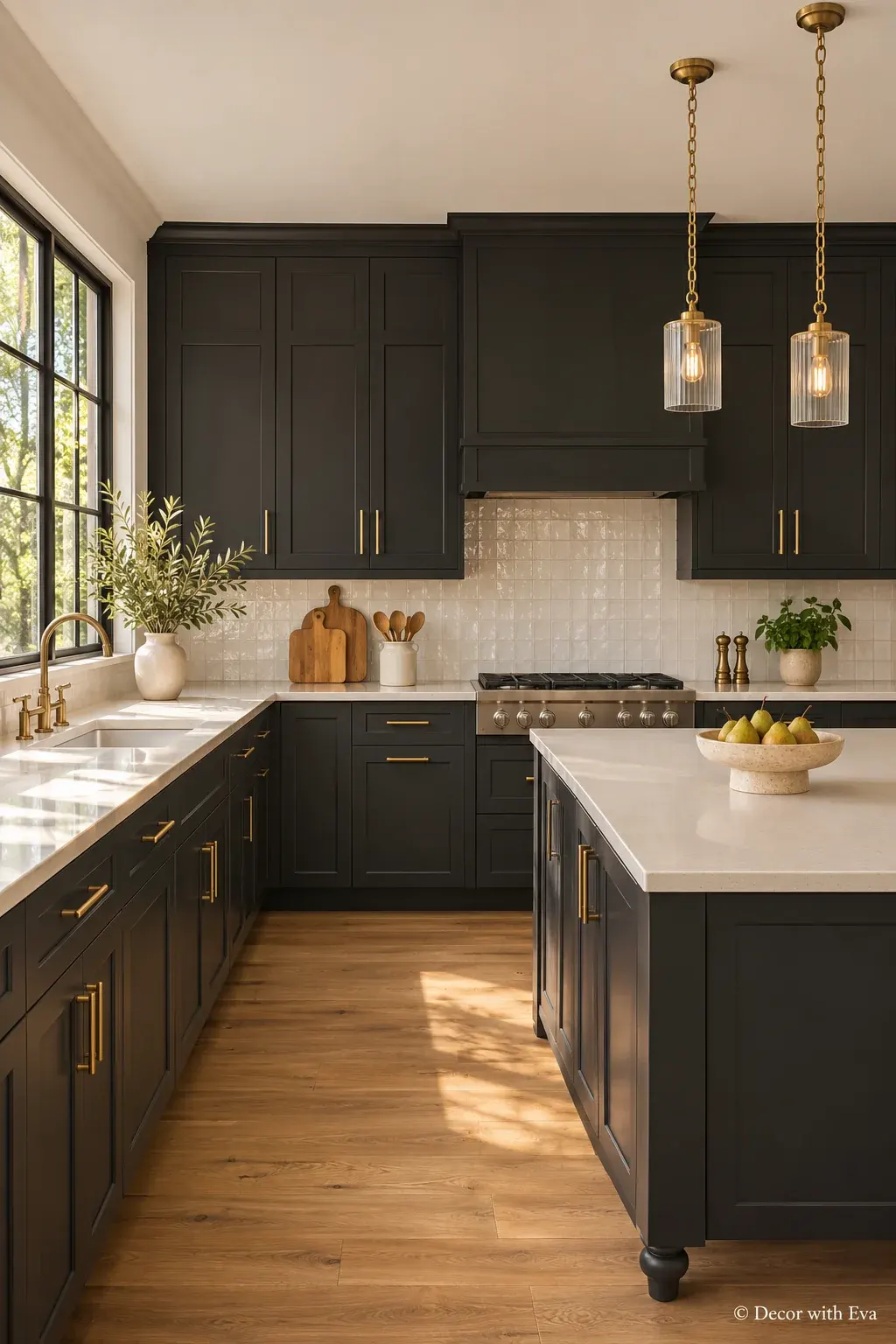
Soft black cabinets can look inviting when the surrounding materials are warm. Use a black with a gentle brown or green cast if it suits your floor, then pair it with creamy counters and oak. A pale backsplash gives your eyes a break between the upper and lower runs.
Brass handles make the cabinet fronts easy to read. Small striped-glass pendants repeat the warm metal without adding an opaque block above the island. A stone bowl is enough decoration on a busy working counter; store other items inside the cupboards.
Try this: Try black on a moveable board at both ends of the kitchen before painting every cupboard.
18. Chocolate Cabinets With Ivory Details
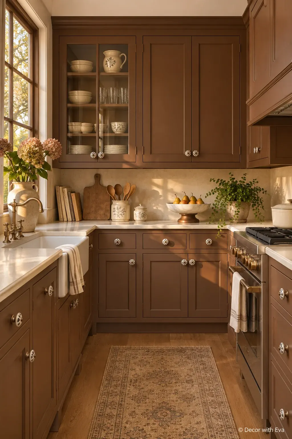
Chocolate brown is worth considering if you want depth without a blue or green cabinet color. On painted inset doors, the warm brown can feel almost like furniture. Cream tile and ivory counters provide the light surfaces that keep the room comfortable.
Off-white patterned ceramic knobs make a charming detail on a smaller cupboard or pantry. Use the assortment deliberately, and keep the rest of the hardware simple. Their long mounting bolts may need adjustment for the door thickness, so check the fit before replacing a whole kitchen’s knobs.
Try this: Start with a chocolate pantry or a short cabinet run if you are unsure about taking the color across the room.
19. Burgundy Cabinets With Warm White Walls
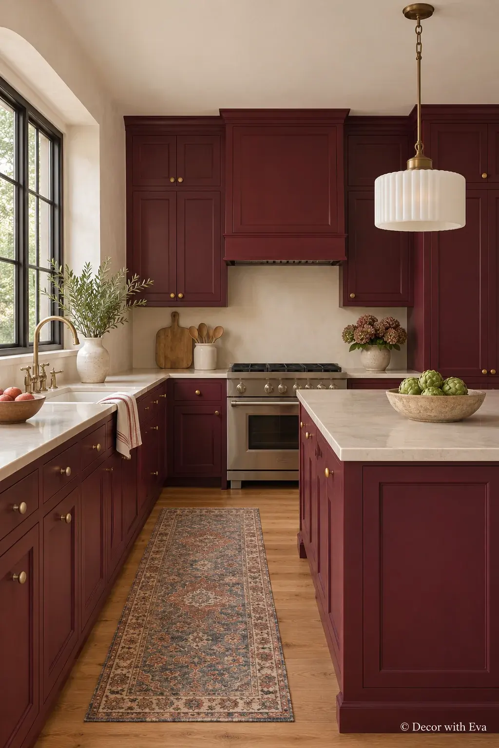
Burgundy brings a red-brown richness to kitchen cabinetry. A muted version is easier to place beside wood and cream than a very bright red. Let warm white walls, a light counter, and an uncomplicated backsplash frame the color.
Aged-brass knobs and a broad milk-glass pendant suit the deeper palette. A subdued blue-and-terracotta runner can connect the red cabinets to a wood floor without needing matching red accessories. Before choosing the runner, check its actual width and the doors that open over it.
Try this: Put burgundy and a browner red sample beside your floor; the more flattering choice is not always the one you liked on its own.
20. Terracotta Cabinets With Sand-Colored Stone
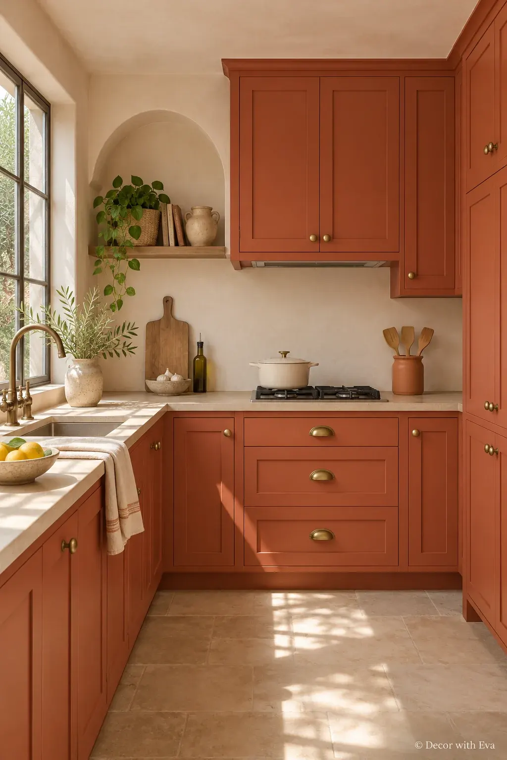
Terracotta cabinets bring an earthy orange-red into the room. Choose a dusty clay shade for a softer effect, then pair it with sandy stone, cream walls, and natural wood. Plain cabinet profiles let the color stay inviting rather than busy.
Antique-brass cup pulls work with the warm palette. A simple terracotta crock repeats the clay color in a smaller object, but you can also use a bowl or pot you already have. Keep the crock near the preparation area and leave enough room to lift tools without knocking adjacent jars.
Try this: Compare terracotta with your tile grout and floor as well as the countertop; large warm surfaces can reinforce one another.
21. Blush Cabinets With Cream and Brass
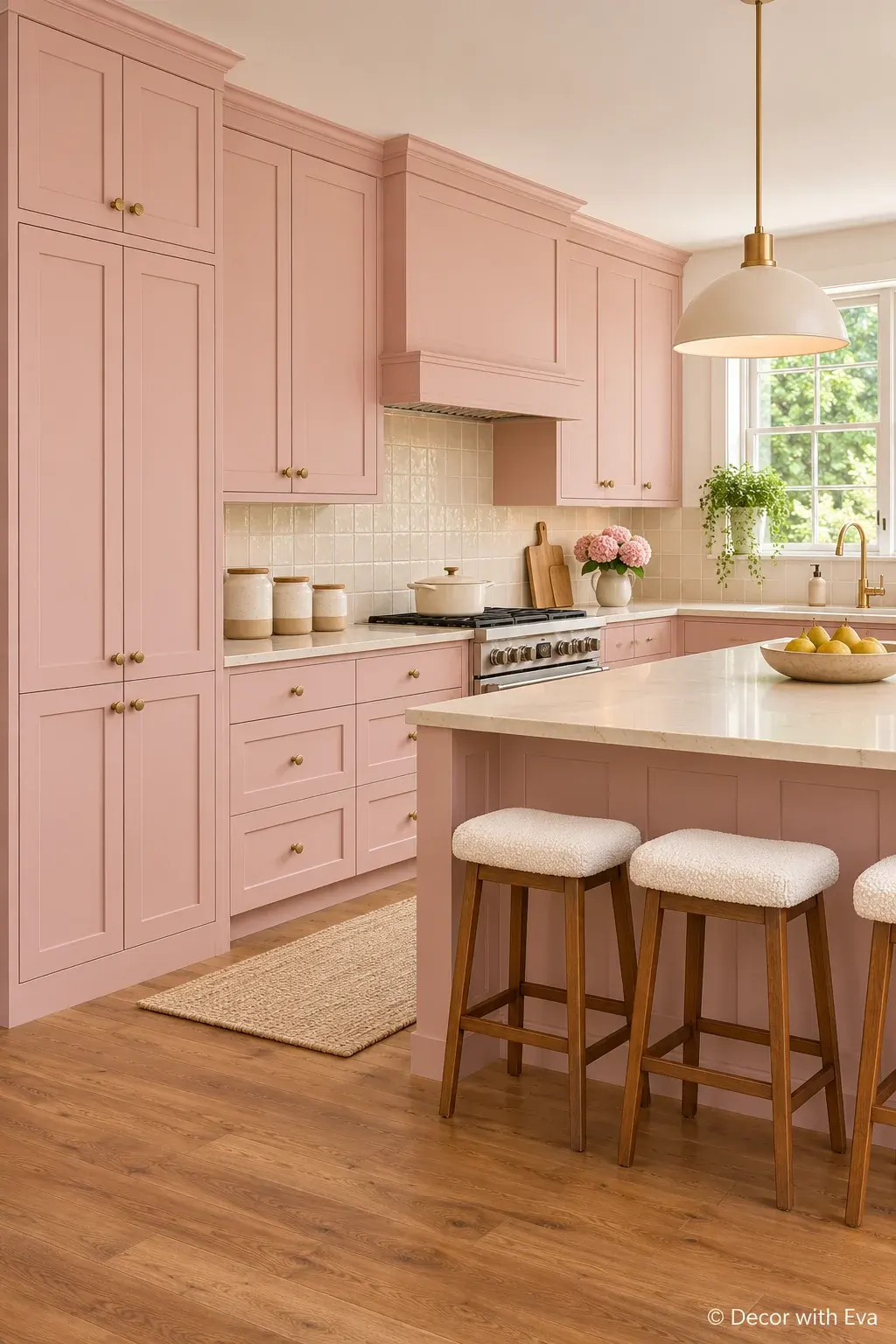
Blush cabinets can feel grown-up when the pink is muted and the surrounding materials are simple. Look for a petal shade with beige or brown in it, rather than a very sugary pink. Cream counters and medium-toned wood help the palette feel grounded.
Small fluted brass knobs add detail without overwhelming the doors. A white upholstered stool and ivory canisters keep the supporting colors calm. If pink is new territory, try it on the island first and keep the perimeter in the warm neutral you already enjoy.
Try this: Place a blush sample next to a peach sample to see whether your kitchen favors a pinker or warmer direction.
22. Dusty Mauve Cabinets With Walnut
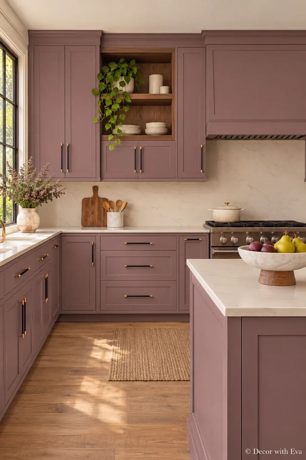
Dusty mauve is a good option when blush feels too sweet and purple feels too strong. Its rosy-brown undertone looks particularly interesting beside walnut and warm white stone. Keep the door profile uncomplicated so the subtle color has room to show.
Black-and-bronze pulls give mauve a little definition. A white marble bowl repeats the counter color, while its wood pedestal picks up the shelf or floor. Avoid adding several other pink and purple accessories; the cabinet fronts already supply a generous amount of color.
Try this: Judge mauve beside both your wood and your wall color, especially under the lighting you use in the evening.
23. Pale Lavender Cabinets With Nickel
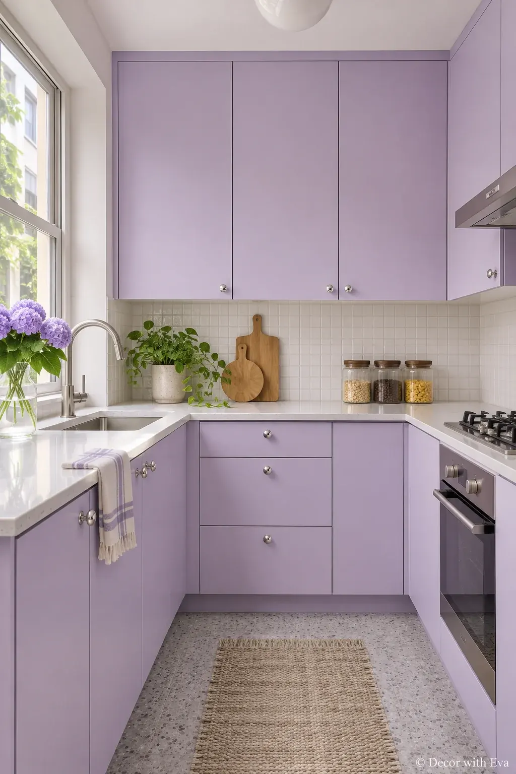
Pale lavender gives a kitchen an unexpected light color without the darkness of plum. Choose a gray-lilac for a softer result, then pair it with white counters and a quiet floor. The cabinet color should remain visible rather than disappearing into the wall.
Small nickel ball knobs suit the cooler palette. Clear ribbed jars with wood lids offer a practical warm accent, especially where the kitchen has little natural wood. Check the jar opening and lid grip before buying a set for ingredients you use every day.
Try this: Look at lavender samples beside your stainless appliances; their reflections can make some shades feel cooler.
24. Cobalt Cabinets With Blue-and-White Knobs
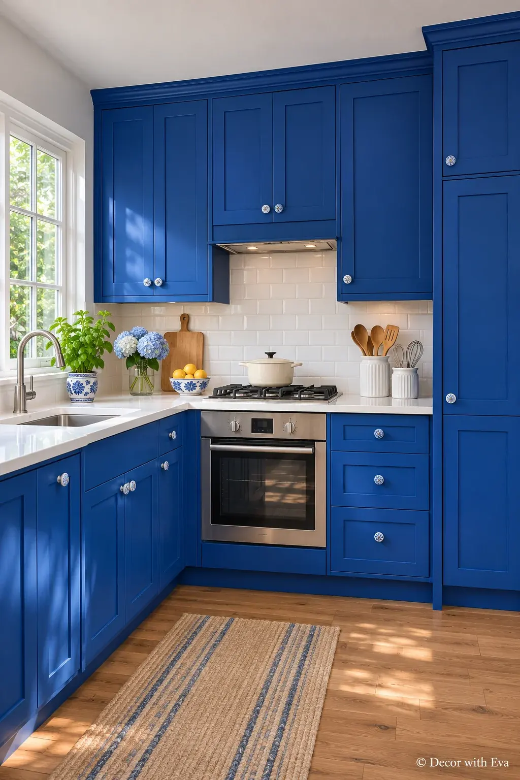
Cobalt is for the kitchen where you want the cabinets to be the first thing you notice. A clear, saturated blue looks particularly fresh with white counters and tile. Keep the wall and floor pattern modest so the cabinet color does not have to compete.
Blue-and-white ceramic knobs can turn a plain pantry or smaller cabinet run into a feature. The mixed patterns work best when the nearby backsplash is simple. White utensil crocks keep the countertop storage connected to the light surfaces, while a wood floor supplies warmth.
Try this: Try the patterned knobs on one cupboard before deciding whether you want the detail throughout the kitchen.
25. Coral Cabinets With Matte Black Cup Pulls
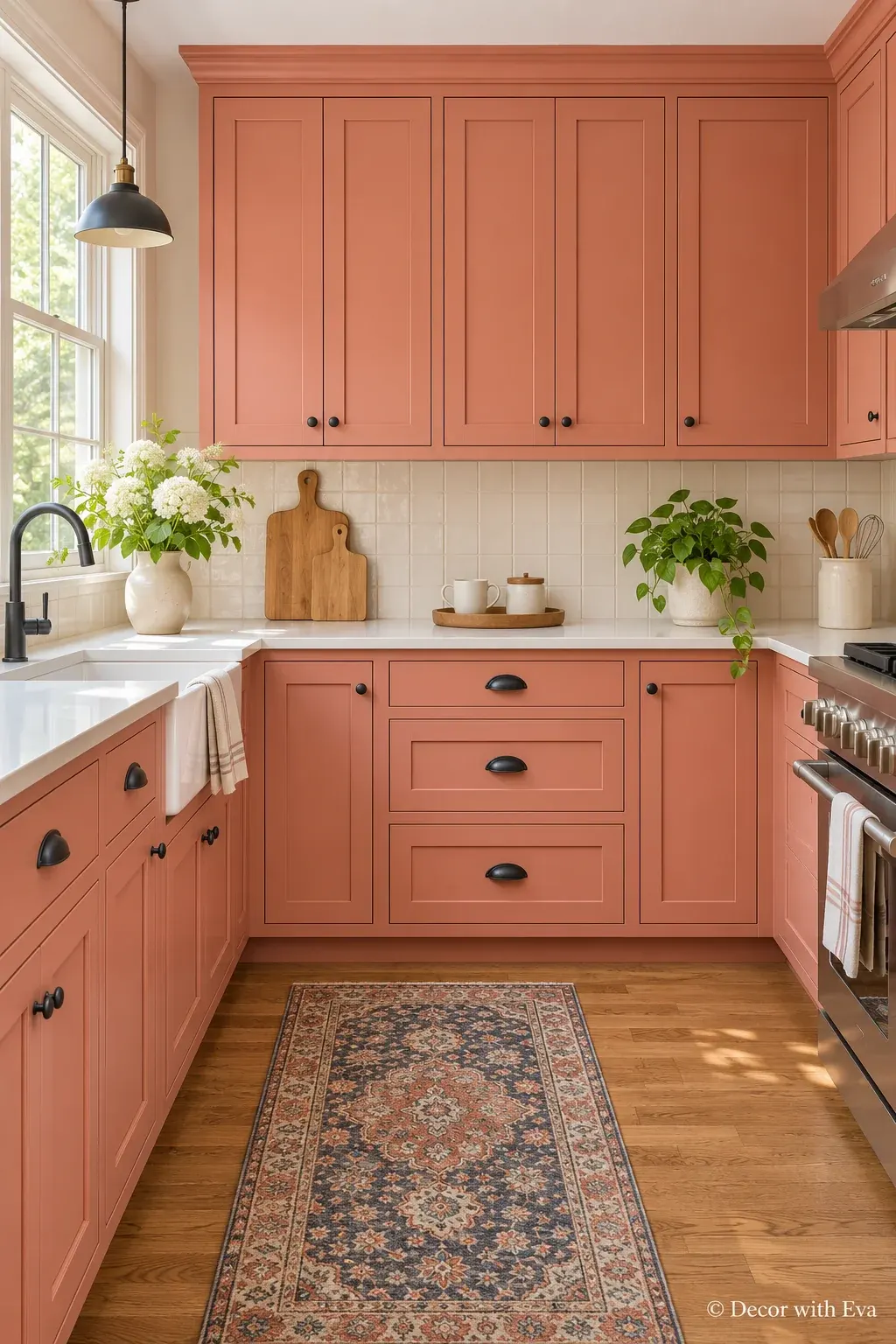
Coral brings a lively pink-orange to cabinetry. A dusty version works nicely with cream tile and oak, while matte-black hardware gives the warm color a sharp outline. Repeat black sparingly elsewhere, such as in a faucet you already own.
A wood tray groups small daily items, and a muted navy-and-terracotta runner adds another color lower in the room. Keep the runner clear of the cooking path if it catches underfoot or interferes with appliance doors. A simple flat floor can look just as good.
Try this: Compare coral and terracotta samples together; coral will usually read pinker against the same white counter.
26. White Uppers With Ocean Blue Lowers
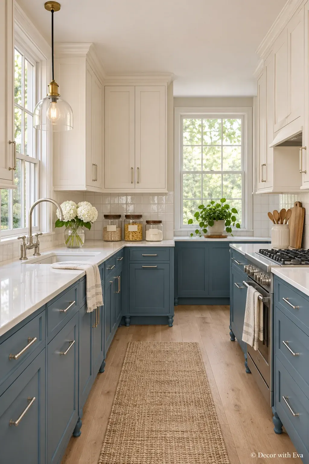
White upper cabinets and ocean-blue lower cabinets give a small kitchen color without taking every surface dark. Keep the upper doors close to the wall color so the room has fewer visual breaks. The blue below the counter can then become the main feature.
Use one hardware family across both levels to connect them. Clear glass lighting and a small group of pantry jars add interest while keeping the upper part of the kitchen light. You can also keep your existing lights and let the two cabinet colors do the work.
Try this: Choose the white and blue together, checking both against the same backsplash sample.
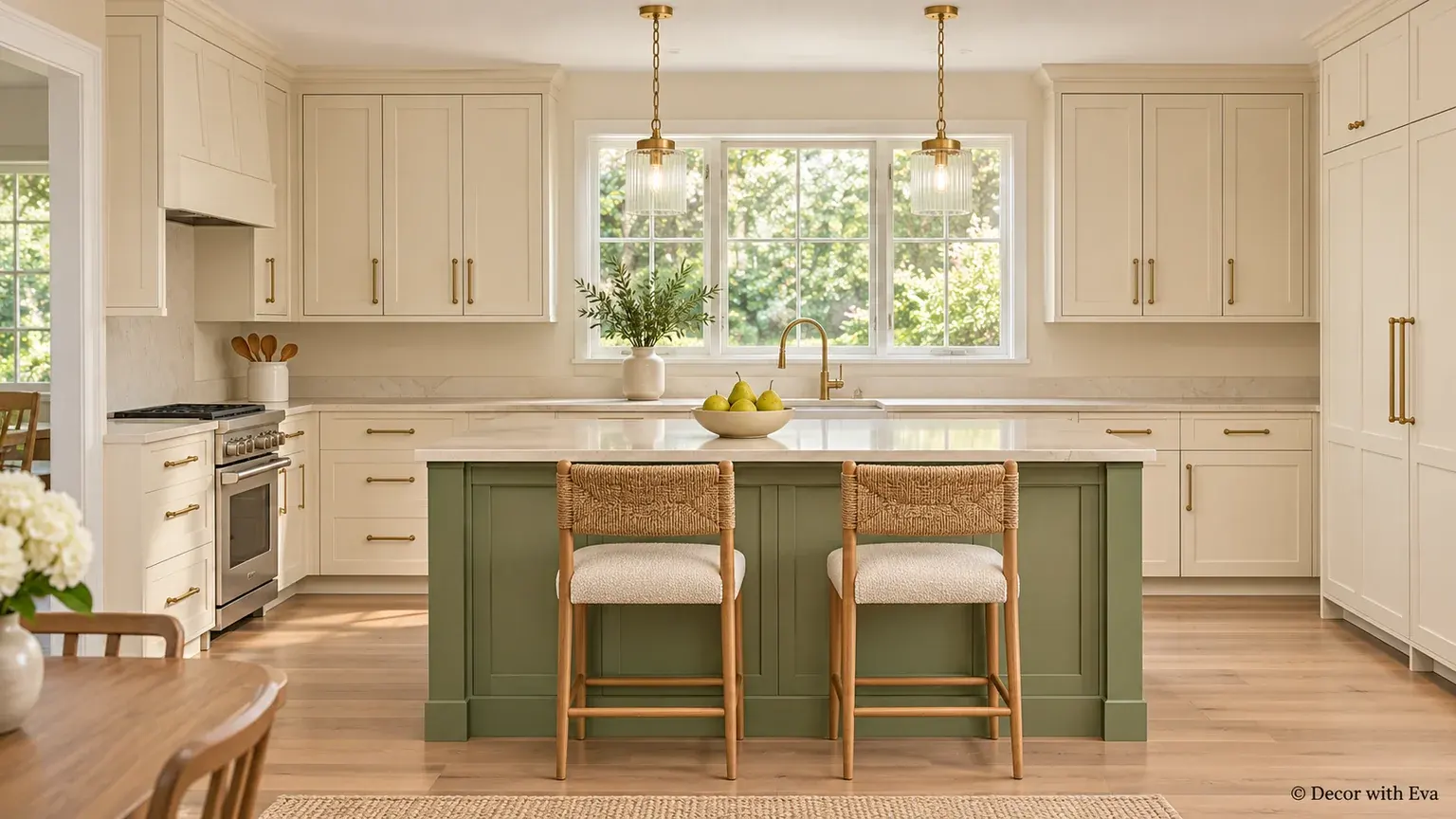
27. Cream Perimeter Cabinets With a Sage Island
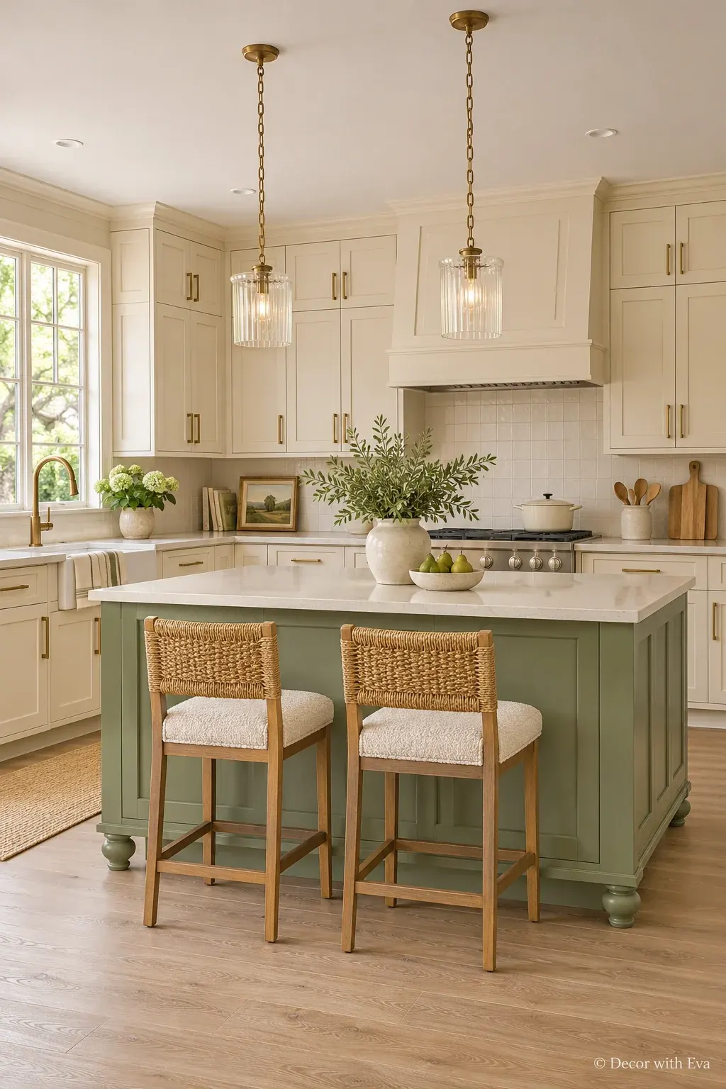
A sage island with cream perimeter cabinets gives you a contained place to introduce color. It is a useful approach when the wall cabinets still suit the room or when you want the island to feel like a separate piece of furniture.
Repeat the same warm brass handles across the two colors, then add woven-back stools for texture. Small clear-glass pendants leave the color relationship easy to see. If your kitchen has no island, try the green on a freestanding pantry or a lower cabinet bank instead, while keeping access and circulation practical.
Try this: Stand at the entrance and check how the cream and green read together from the view you see most often.
Plan the Refresh Before You Order
Make a simple list of what actually needs changing. A cabinet color update may work with your current counter, faucet, and lights. Measure handle-hole spacing, count doors and drawers separately, and try one hardware sample before ordering a kitchen’s worth.
For painting, identify the cabinet material and existing finish before choosing a coating system. Cleaning, surface preparation, a suitable primer where required, and the paint’s drying and curing instructions all affect the result. Benjamin Moore’s cabinet-painting guide explains the preparation sequence. Follow the instructions for the specific products you use, including ventilation and time before returning doors to service.
A small roller kit and angled brushes can be useful for a suitable DIY project, but choose the roller sleeve and brush recommended for your coating. If you are keeping the existing finish, skip the painting supplies and focus on the hardware or countertop arrangement.
Once the cabinets are settled, use these kitchen counter decor ideas to arrange the items you reach for daily while leaving room to cook.
Kitchen Cabinet Color Questions
What kitchen cabinet color is easiest to work with?
Warm white, cream, putty, and muted gray are flexible starting points, but none works with every countertop. Compare samples beside your existing finishes. A white with the wrong undertone can be more distracting than a well-chosen blue or green.
Can dark cabinets work in a small kitchen?
Yes, if you enjoy the contrast and can see the cabinet details under the room’s lighting. Keep the countertop and backsplash relatively simple, or use the dark color on the lower cabinets only. Judge a large sample from the kitchen entrance as well as close up.
Should upper and lower cabinets be the same color?
They can be, but they do not have to be. Matching cabinets create a continuous block of color. A lighter upper run with a colored lower run changes the balance, while a contrasting island gives you a smaller place to try a new shade.
What hardware should I choose for colored cabinets?
Start with the color relationship you like: warm brass with olive or cream, bright nickel with blue or lavender, or black with coral and charcoal. Then check the physical fit. Mounting-hole distance, door thickness, handle projection, and screw length matter as much as the finish.
Do I need to replace my countertop to change the cabinet color?
Often you can build the new palette around the counter you already have. Use its background and veining as starting points, and compare cabinet samples directly beside it. Replacing a useful counter is a much larger decision than changing paint or handles.
Which paint finish should I use on kitchen cabinets?
Use a coating intended for your cabinet surface, in a sheen offered for that system. Satin and semi-gloss are common options, but preparation, application, and curing instructions matter. A color sample helps you choose a shade; it does not replace the final cabinet coating.